Colors, icons & weekends
How bars look, and how the timeline itself is drawn. Most of these work in both modes; status/priority coloring needs TaskNotes.
Bar colors
Bars can be colored in a few ways, set per view under Settings → Appearance:
- Bar color source — the default hierarchy palette (green parents / blue children), By status, By priority, or Obsidian theme. By status and By priority need the TaskNotes companion palette; standalone they fall back to Default.
- Bar color mode — a full Fill or a left-edge Strip that leaves the bar body neutral.
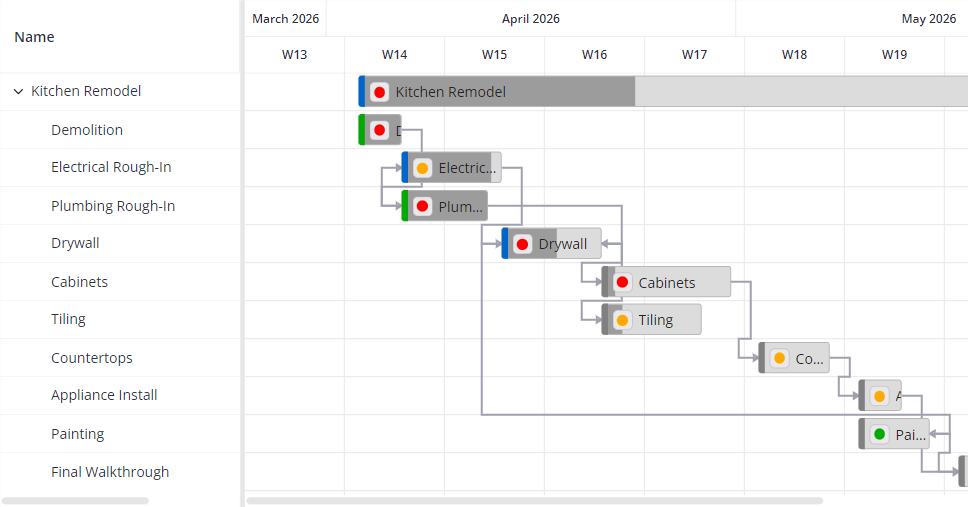
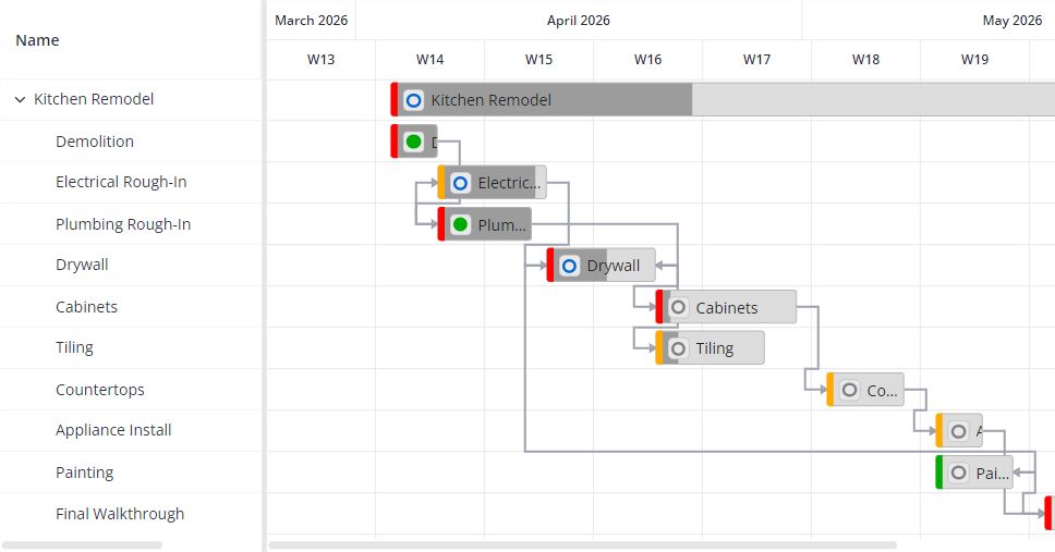
The same kitchen-remodel tasks under different source × mode combinations (click any image to zoom):
| Light | Dark |
|---|---|
 |
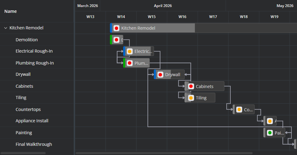 |
A left-edge strip coloured by status (green done, blue in-progress, grey open), with priority icons on each bar.
| Light | Dark |
|---|---|
 |
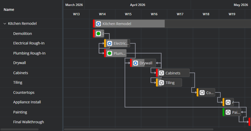 |
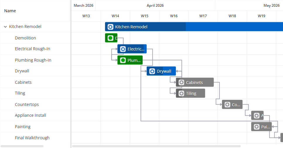
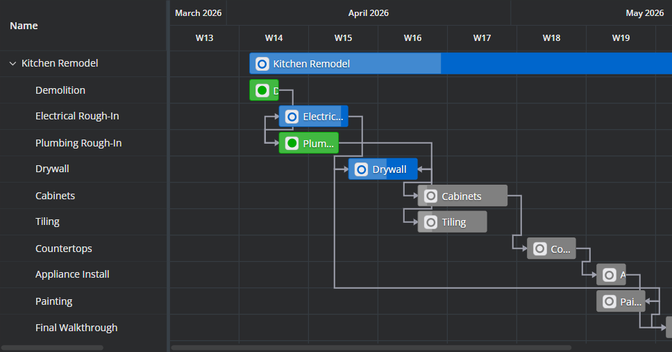
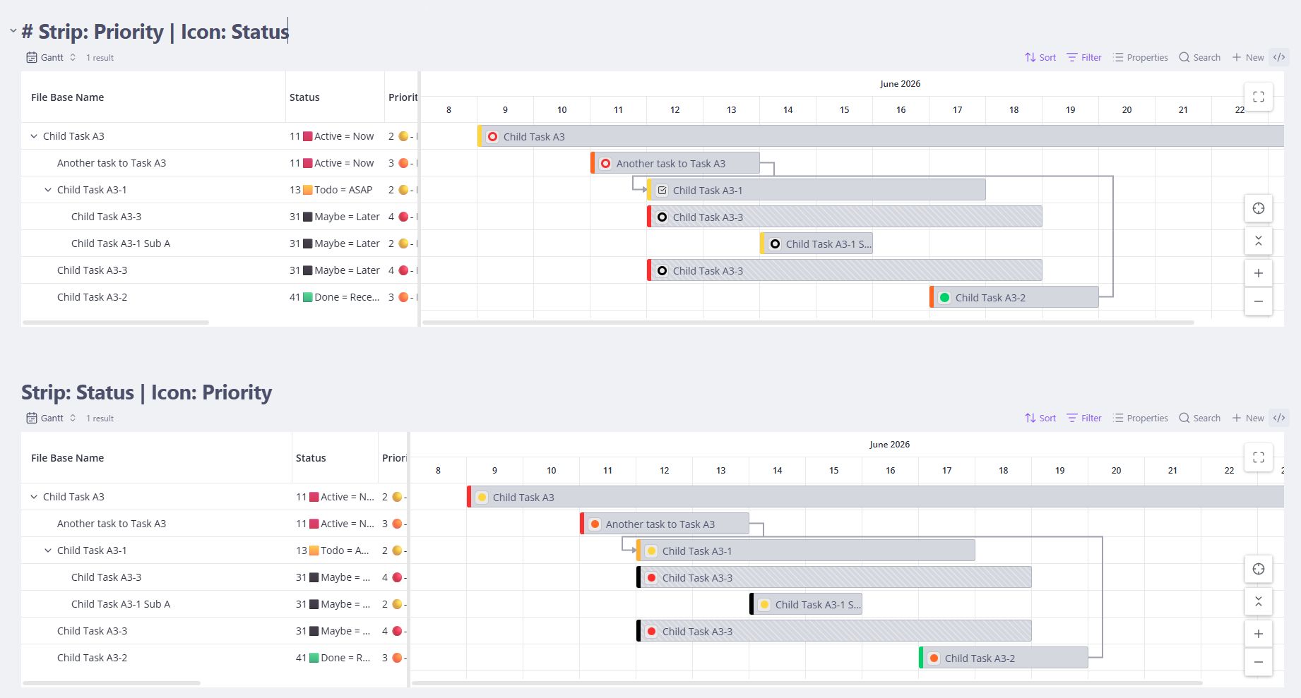
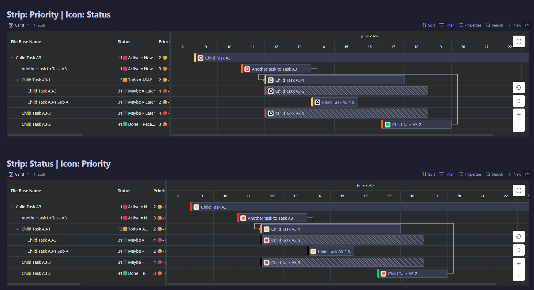
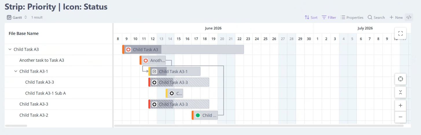
The same strip, now coloured by priority, with status icons — swap which attribute the strip and the icon each show.
| Light | Dark |
|---|---|
 |
 |
Fill mode floods the whole bar with the status colour instead of a thin strip — bolder, when colour is the main signal you want.
| Light | Dark |
|---|---|
 |
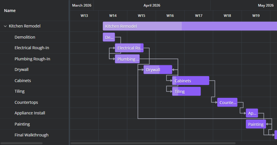 |
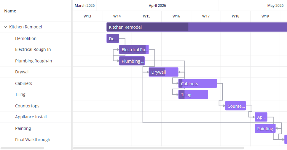
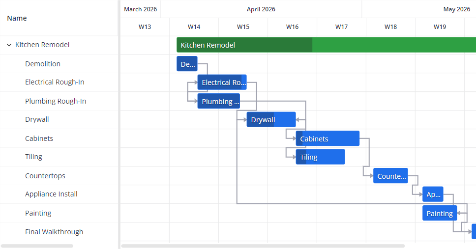
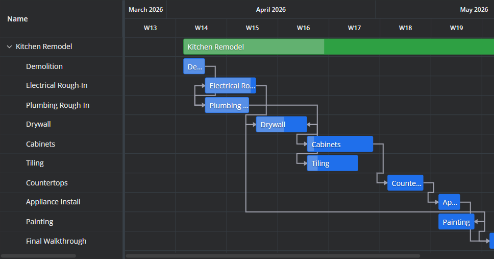
Obsidian theme colours by your accent colour — children the raw accent, parents a higher-contrast tone. Change your accent and the bars re-tint live.
| Light | Dark |
|---|---|
 |
 |
The Default palette ignores your theme: green parents, blue children. It looks the same in every vault.
Default vs Obsidian theme
Both color bars by hierarchy — parents one tone, children another — but they source that color differently:
- Default uses a fixed palette that ignores your theme: green parents, blue children. It looks the same in every vault.
- Obsidian theme follows your accent color (Settings → Appearance → Accent color, or whatever your theme sets). Children take the raw accent; parents a higher-contrast tone of the same hue — so a yellow accent gives yellow bars, and changing your accent or theme re-tints them live.
Hierarchy coloring applies only to these two sources. Under By status and By priority, every bar is colored by its own value — parents and children alike.
| Light theme | Dark theme |
|---|---|
 |
 |
Task icons
A small Task icon can sit on each bar, showing its Status or Priority (companion only), or None.
Date-status indicators
Show date-status indicators on bars signals any bar with an incomplete or reversed date range, and the signal names which problem it found. A task with one date missing (the other inferred) or with no dates (placed at today as a placeholder) is cut with a torn, zigzag edge on the side that was never authored, so the bar reads as unreliable exactly where its date is. A task with start and end swapped takes a distinct orange treatment instead. A task carrying both dates in chronological order is never flagged; there is no "overdue" marker. On by default.
The teeth are capped by the bar's own width, so a short task at a coarse zoom — a one-day placeholder on a month scale, say — can be too narrow to show them. Zoom in when you need to be sure whether a bar's dates were authored.
Reading bar decorations
Four visual cues can appear on a bar. The two date cues are alternatives — a bar is torn or orange, never both — while the hatch and the fade say nothing about dates and can stack on top of either:
| Cue | What it means |
|---|---|
| Torn (zigzag) edge | That side's date was never authored — inferred from the other date, or placed at today because the task has no dates. The tear sits on the side the missing date belongs to, so a bar can be torn on one edge or both. Toggled by Show date-status indicators on bars. |
| Orange bar | The task's start falls after its due date. A fully-dated task in the right order is never orange. Toggled by Show date-status indicators on bars. |
| Diagonal hatch | The same task appears in more than one place — e.g. a note shown under several parents. Every copy is hatched equally; none is the "real" one. This is about duplication, not dates. |
| Faded / muted bar | A context row pulled in by Show all expansion that doesn't itself match the Base's filter — shown only for structure. Its faintness is the Expanded items opacity (55% by default). |
Weekend shading
The timeline shades weekend day-columns so a multi-day bar doesn't read as if the whole span were working time. Weekend days follow your locale.
Controlled by Highlight weekends (on by default).
Shading only shows at day/hour scales
Weekend columns are only meaningful when individual days are visible, so shading renders at the hour and day scales, not at week or month.
Maximize within Obsidian
The ⤢ button in the top-right corner of the chart expands it to fill the Obsidian window — without pushing Obsidian's own modals, menus, command palette, or hover previews behind it. Full walkthrough (and how to exit) in Chart controls → Full screen.
Layout
The grid/timeline split is resizable and remembers its width, and you can set a min/max height and toggle a toolbar. All of these live in Settings → Appearance.